Ever wonder how YouTube’s current highest earner Mr Beast crafts thumbnails that everyone clicks on? Find out as we explore the tactics used by top B2B creators to create irresistible thumbnails for their videos.
YouTube thumbnails are those small, clickable images you see before you decide to watch a video. Despite their size, they pack a mighty punch when it comes to attracting views. A good thumbnail gives a sneak peek into the video’s content and entices viewers to click.
Since the video’s click-through rate is a biggest factor in YouTube’s search algorithm, having a captivating thumbnail can land you near the top of search results. And it will be more likely to pop up in recommended lists.
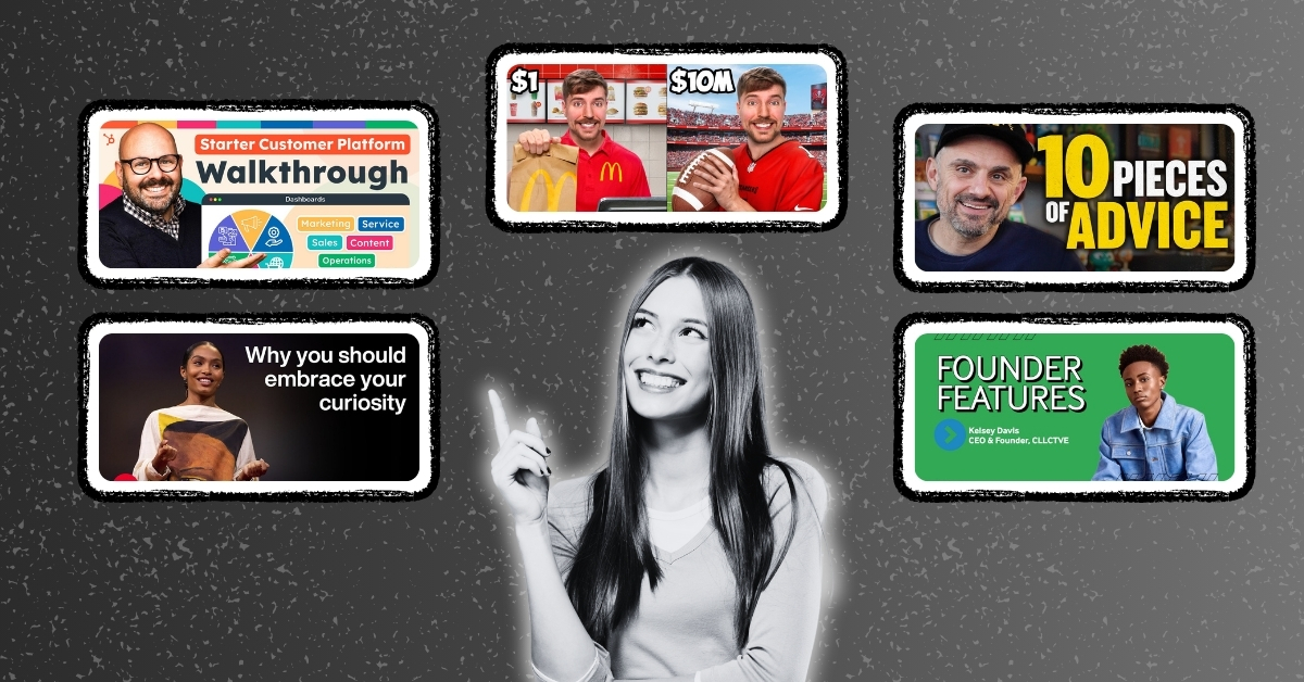
On the basis that it’s easier to learn by example, we’re breaking down the thumbnail choices of five successful YouTube channels to show you what works and why. Most are from B2B content so you can take inspiration and apply to your own customer testimonial videos and thought leadership.
For thumbnail strategies that help your videos cut through the noise, get high click-through rates, and rank better in search results, read “How to Craft a Scroll Stopping Video Thumbnail for YouTube.”
#1: Mr Beast
With over 250 million subscribers, Mr Beast is currently the highest earner on YouTube. He’s not a B2B content creator and, on the surface, this may seem like an unlikely place for B2B marketers to be searching for best practices. But creativity counts as much in B2B as it does in B2C, and there are lessons to be learned from those who have mastered the art of capturing attention. Thumbnails are a big part of his success, and he spends a lot of time and money crafting them to perfection.

Why they work:
- Relatable images humanize the channel.
- Close-up of the face with expressive features evokes emotion.
- Relevant yet unexpected background to stop scrollers in their tracks.
- Bold and contrasting colors stand out in a busy feed.
- Text is kept at minimum with an intriguing promise.
- They’re witty and a little unexpected
Borrow this style when:
You want to build a strong personal connection with the audience, for example, in introductory videos or behind-the-scenes peeks into your business operations. This approach works well for showcasing the human side of your brand, making it more fun, relatable and trustworthy.
#2: Gary Vaynerchuk
With 4.38 million subscribers‧ and 4.9K videos posted on YouTube, Vaynerchuk has a wealth of experience in creating effective thumbnails.
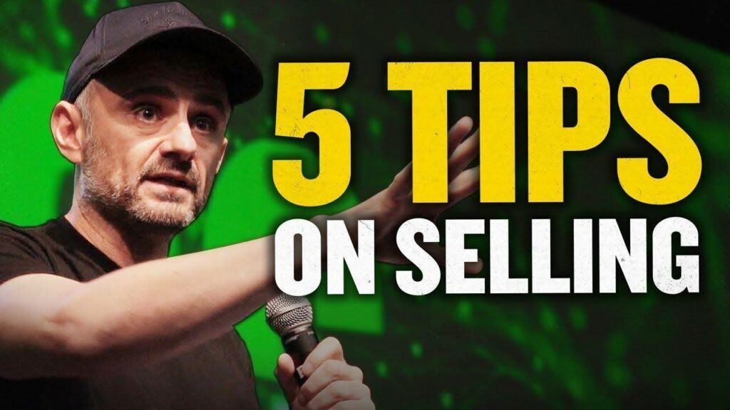
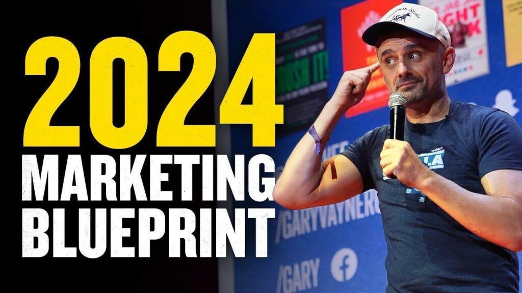
Why they work:
- Vibrant, contrasting colors that stand out.
- Easy-to-read text that teases the content with no surprises.
- A clear focal point and catchy title.
- Body movement (pointing, gesticulating) induces emotion and creates a sense of dynamic action – users know this will be an energizing and thought-provoking video to watch.
Borrow this style when:
Your video testimonial or expert video promises a single learning experience or theme (“tips on selling”) and you want to create a sense of excitement and urgency around your content. This approach works well for interviews with industry experts where you want to highlight key points or takeaways in an eye-catching manner.
#3: TED
TEDx Talks feature a variety of speakers and topics, but their thumbnail style is consistent throughout.
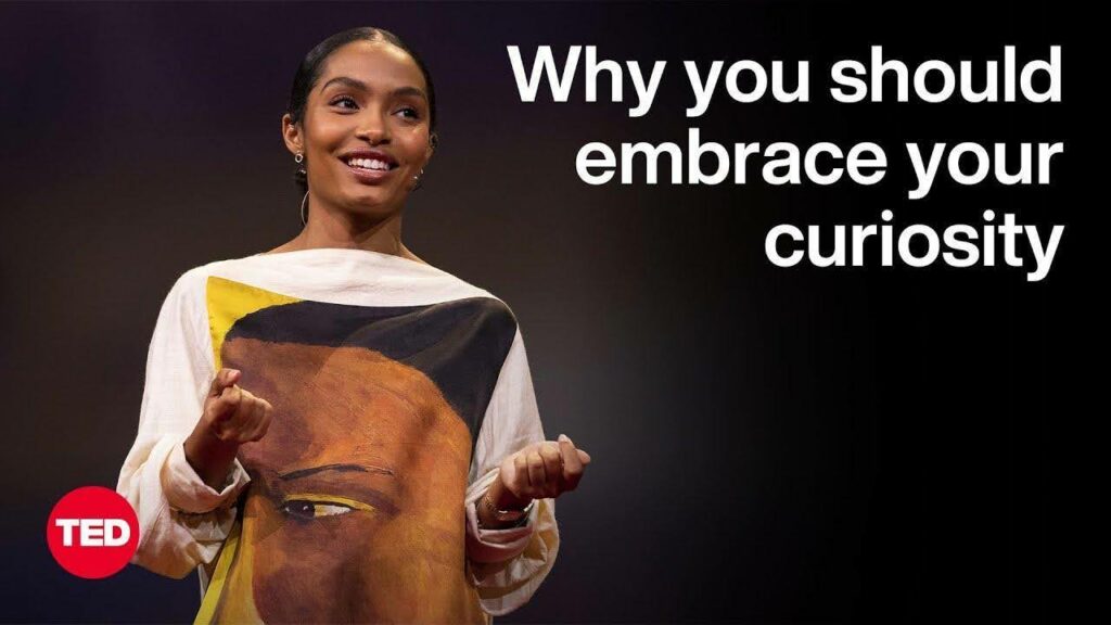
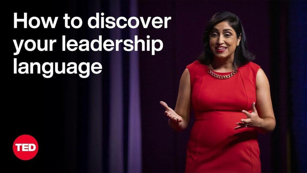
Why they work:
- Clean, sophisticated and minimalist.
- Conveys serious business content.
- Action shot of the speaker, captured from the video, with good dynamic movement implied in the image.
- Limited color palette with pops—red is a bold color that stands out in a crowded feed.
- Follows the compositional rules of thirds, with the speaker taking up two-thirds of the shot and positioned optimally.
- The title is clear and concise, with a promise to teach something new.
Borrow this style when:
You want to showcase your thought leadership content or expertise in a particular field. This approach works well for webinars, conference presentations, or any video where you are sharing valuable insights or knowledge with your audience, especially if you want to maintain a polished corporate image for your brand.
#4: HubSpot
Known for their marketing, sales, and services software, HubSpot’s video thumbnails showcase their tools and strategies and are designed to appeal to busy professionals.
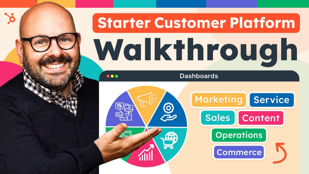
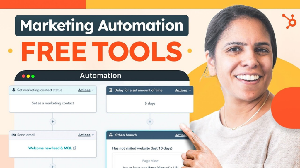
Why they work:
- Informative and to-the-point text that highlights the main benefit.
- Digs right into the customer pain point and promises to make their life easier (“free tools”, “platform walkthrough”).
- Image of a person smiling and pointing at something creates a positive and helpful association—you will learn something valuable in this video.
- Visual elements like arrows and graphics stand out in busy feeds.
- Capitals used sparingly to emphasize the thumbnail’s power words—FREE TOOLS.
- Consistent use of branding elements to build recognition.
- Combination of graphic elements and real photos to maintain a balance between informative and engaging.
Borrow this style when:
You need to convey complex information in a straightforward and appealing manner. This is ideal for product demos, how-to guides, and case studies where clarity and usefulness are the main selling points, and you wish to convey the main message at a glance.
#5: Techstars, Founder Features
Techstars’ Founder Features series highlights successful entrepreneurs and shares their insights on a range of trending topics. Surprisingly for Techstars, this thumbnail falls short in some areas and is a good lesson in how a few simple tweaks can improve the quality of your thumbnail by orders of magnitude.
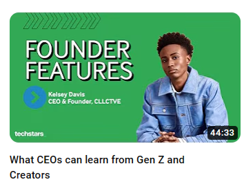
Why it works:
- Simple yet powerful branding element with a strong logo and vibrant color scheme.
- Plenty of white space (or green space, in this case) makes the thumbnail easy on the eyes.
- Photo of a young founder complements the title, “What CEOs can Learn from Gen Z and Creators.”
- The text creates a sense of exclusivity—”founder features” hints at insider secrets or success stories that will be revealed in the video.
How it could be improved:
- Blue on green is not the most readable combination, especially in small thumbnails.
- Text is too small to read Kelsey’s name. Viewers might miss these important details.
- The image is too safe. It could play on the title by showing, for example, a young besuited CEO-type that screams “I’m a seven-figure entrepreneur and a Gen Z.” This would stop scrollers in their tracks and create intrigue.
Borrow this style when:
You have a video series with a clear value proposition and want to build credibility around your experts. A thumbnail like this, in its optimal format, makes it easy for viewers to see the why behind hitting ‘play’.
Create Scroll-Stopping YouTube Thumbnails
Just like the subject line of an email, the thumbnail of your YouTube video can make or break whether someone clicks play. And you need them to watch your video testimonial, otherwise the dollars spent on creating it ends up being wasted. We encourage you to learn from these leaders, but don’t copy them. Borrow ideas and make them your own, so when someone scrolls past a video in their feed, they’ll know it’s original, it’s worth a click, and it’s from you.
Looking to elevate your B2B video strategy? Our playbook How B2B Companies Can Win at YouTube is your toolkit for crafting thumbnails, titles and descriptions that drive views and engagement. With practical examples from top B2B channels, you’ll get tips, tricks and proven tactics to help you succeed on the world’s largest video platform. Download your free copy now.

